Aternos GmbH

aternos.gmbh

Aternos Branding

Name

In the logo Aternos is written capitalized. This is reserved for the logo only and should not be used in any texts. In texts Aternos is written as a regular name, so just the A is capitalized. Also the name is not Aternos.org, that's just the website, which should be written as aternos.org. The website is also not www.aternos.org, just aternos.org.

Logo

Structure

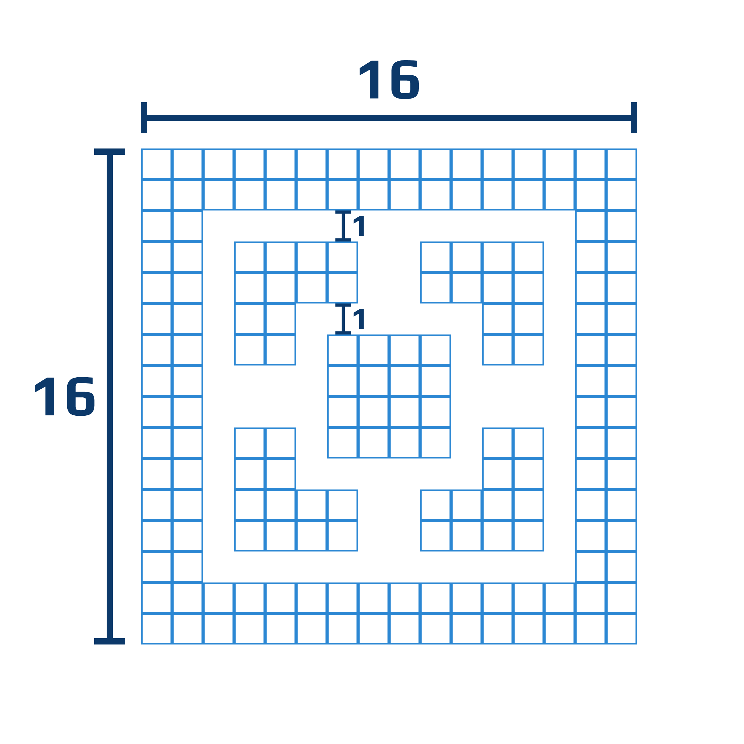
The basic logo has an relative size of 16x16, which can be proportionally increased. It has a border with a width of 2, 4 corners and a square in the middle. There is a space of 1 between these elements.

Use the logo only in a single color, either blue or light grey.
Place the logo on a single color, either light or dark grey.
Leave enough space between the logo an other elements.
Don't use any other color.
Don't place the logo on an image.
The logo must not touch other elements.
Don't modify the shape of the logo.

Colors

The main color choice is the dark or light grey color as background and the other one as text color. These color combinations can be swapped for different sections, e.g. on longer website like this one or the Aternos frontpage. Other colors must not be used as a general background. It is allowed to use the Aternos blue or the dark blue as text color for titles or labels, but it is not allowed to use them for longer texts. Secondary colors must not be used as text color, but they can be used as button or label background colors or to color specific elements. All colors can be lightened or darkened to represent hover, active states or to highlight elements, e.g. titles in a colored element.

Aternos Blue
#2B87D3
Used in the logo and for important parts, e.g. titles or labels. Can also be used in more general cases e.g. as blue button or label.
Dark grey
#2D3943
Used as background, for elements or as text color on light grey.
Light grey
#F0F0F0
Used as background, for elements or as text color on dark grey. Can be replaced with white/#ffffff if necessary (e.g. for printing).
Dark blue
#0C396A
Used on light grey background for titles or short texts as variant to the main blue. Don't use it for long texts or elements.
Green
#1FD78D
Used for elements, but not as text or full background.
Red
#F62451
Used for elements, but not as text or full background.
Orange
#EB7B59
Used for elements, but not as text or full background.

Fonts

Play

The main font is the Google font "Play". It is used in the logo, in all headings and in all regular texts, on buttons and for titles.
A B C D E F G H I J K L M N O P Q R S T U V W X Y Z
a b c d e f g h i j k l m n o p q r s t u v w x y z
0 1 2 3 4 5 6 7 8 9 0

Roboto Mono

For use cases, where a monospaced font is required for better usability e.g. for consoles, text editors or logs the Google font "Roboto Mono" can be used. It should only be used for the required part, not for titles or buttons
A B C D E F G H I J K L M N O P Q R S T U V W X Y Z
a b c d e f g h i j k l m n o p q r s t u v w x y z
0 1 2 3 4 5 6 7 8 9 0